
Excel Dashboard Design
EnginExcel uses an user-friendly design and customised colour palettes to deliver nice looking Excel dashboards to Project Managers and Mechanical Engineers.
When I work on my design projects I like to go in the detail of the problems, but I also notice that I must be able to get the bigger picture to be aware of where we are and where we are heading to. When showing the project status to the stakeholders (either my boss or our customers) it's important to be able to summarise as much information as possible in a synthetic and tidy way. This helps me to get a clear picture of the project and provide my boss/customer with a synthetic overview without having to spend a lot of time going into too much detail. I think dashboards can really help to achieve this target.
The beauty of Excel is that it allows to include a big amount of data in various sheets, do complex calculations and then sum everything up in one place by creating links to the data. As an example, when I manage a project I have one page where I record the completion of each sub-task. This is summarised in the overall project completion status. Another page is used to record the financial status, including the resources that were available at the beginning, the ones currently available, the distribution, etc.
A third page records the resources that have been allocated to a certain sub-project, their availability and the hours they have been booked.
Each of these pages creates some crucial information which is collected on the dashboard page. This includes, for example, the total amount of resources spent, the amount available and the level of completion of the project. Every Monday I update the data in the spreadsheet. Then I revert to the dashboard, which instantly tells the few figures that are needed to understand if the project is going in the right direction. The page is formatted using appropriate conditional formatting, colours from well thought palettes and text styles which are designed to direct the user eyes in the right direction and make the results more understandable as possible.
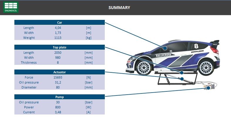
A similar approach can be used when working on the design of a component or a machine. Various calculations can be performed in different sheets. Each of these will output a result (e.g. the diameter of a tube which has been sized over strength, or the dimension of an actuator which has been calculated to apply a certain load). In this case the dashboard will show all the sizes of the component which have been calculated.
I assume various engineers already use this approach to get quick results from their information. The quality, the complexity and the speed of this process can be improved even more when using customised macros created through VBA. These allow to automate the data collection process, creating custom calculations, data input procedures and personalised actions. For example, an user may desire to have an action that automatically copies some data after it's been inputted and pastes it in a different part of the spreadsheet using a different formatting style.
The final quality of a dashboard is connected to various factors, which include:
- Picking the right data to show (= understanding what the data means)
- Showing the data in the right medium, may it be chart, numbers, conditional formatting, filters, etc. (= understanding what the user is looking for)
- Giving the page the right look (= understanding where the user is going to look first)
I find the last point is normally not stressed enough. A good-looking dashboard helps to look more professional in front of our stakeholders, but also to drag the user's attention to the right place without being distracted by clashing colours and mixed bolds and italics.
In the last years I have developed a great passion for photography, which helped me to get a better understanding of how colours fit together and how objects have to be organised in space to look nicer. The combination of this and my understanding of Mechanical Engineering and Project Management makes EnginExcel the right partner for developing efficient and good looking dashboards.